Find designers
Designer search
Quickly find your next designer
Post a job
The #1 job board for design talent
Inspiration
Courses
UX Diploma
Learn UX design from scratch in 6 months
UI Certificate
12-week UI skill building for designers
Live interactive workshops
with design professionals
Jobs
Go Pro
Log in
Dribbble: the community for graphic design
Log in
Sign up
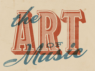
Type Treatment for Upcoming Gallery Show
RONLEWHORN
Follow
Following
Like
#E1CFB3
#B15235
#CDB197
#648285
#C88E71
#505D59
#C27257
#B8674B
Download color palette
design
grunge
texture
typography
View all tags
Posted on Jul 10, 2012
2,738
9
101
10
View feedback
RONLEWHORN
Label Design • Portraits • Illustration • Branding
More by RONLEWHORN
View profile
Previous
Next
Loading…