- The size of the radio and checkboxes seem a little large. How do these look when there is a label next to them?
- Select menus are nice, but are the Up and Down buttons a bit confusing? Normally when you see separate buttons like that you expect to be able to modify the value Up or Down?
@Jason Mayo Thanks for the feedback! texts at their left is their labels. I kept it slightly bigger to make it easier to click considering my target audience. hmmm, that's an another look at dropdownmenu, I'm gonna give it a second look, Thanks!
I am actually a fan of the big radios and checks, the labels were immediately clear to me, on the point about the drop downs I do agree , up and down arrows might be overkill. all in all nice and clean...big like
@Jason Mayo ah ok I got you mean. In this project it is specific to have small amount of options in horizontal row. So it looks okay, you are right for vertical listing. Thanks for the note!
12 Responses
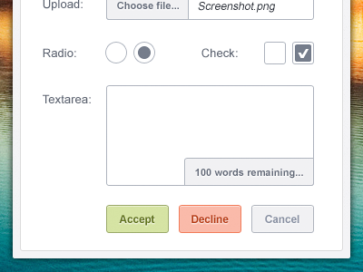
Here is some form elements I designed for this web project. I also attached a full view. Comments are much appreciated!
Thanks! Twitter for updates...
----
Update: I just noticed that "char counter" can be little confusing as it has similar background with some buttons, I'm gonna lighten its bg.
12 months ago
Very nice - Just a few things im not sure about:
- The size of the radio and checkboxes seem a little large. How do these look when there is a label next to them?
- Select menus are nice, but are the Up and Down buttons a bit confusing? Normally when you see separate buttons like that you expect to be able to modify the value Up or Down?
12 months ago
Lovely.
12 months ago
@Jason Mayo Thanks for the feedback! texts at their left is their labels. I kept it slightly bigger to make it easier to click considering my target audience. hmmm, that's an another look at dropdownmenu, I'm gonna give it a second look, Thanks!
12 months ago
I am actually a fan of the big radios and checks, the labels were immediately clear to me, on the point about the drop downs I do agree , up and down arrows might be overkill. all in all nice and clean...big like
12 months ago
super clean love it @Oykun Yilmaz
12 months ago
clean work
12 months ago
crispy as usual buddy, well done!
12 months ago
Not like those buttons to much colors you can use that on hover..
11 months ago
@Oykun Yilmaz But with radio buttons / check boxes you usually get a label then the values. E.g:
Do you like Ice Cream?:
o Yes
o No
o Only Ben & Jerry's
So how would that look next to the radio buttons / checkboxes?
11 months ago
NICE WORK @Oykun Yilmaz
11 months ago
@Jason Mayo ah ok I got you mean. In this project it is specific to have small amount of options in horizontal row. So it looks okay, you are right for vertical listing. Thanks for the note!
11 months ago