Find designers
Designer search
Quickly find your next designer
Post a job
The #1 job board for design talent
Inspiration
Courses
UX Diploma
Learn UX design from scratch in 6 months
UI Certificate
12-week UI skill building for designers
Live interactive workshops
with design professionals
Jobs
Go Pro
Log in
Dribbble: the community for graphic design
Log in
Sign up
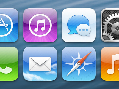
iOS icons
Louie Mantia, Jr.
Available for work
Follow
Following
Like
Get in touch
#5C9BCB
#E8EEF3
#43719B
#AFBAD1
#30536B
#A97286
#CCB331
#3B434A
Download color palette
Redrawing iOS icons for my own amusement in order to fix tiny details that bother me.
app
icons
imessage
ios
itunes
mail
messages
music
phone
preferences
safari
store
system
View all tags
Posted on Jul 8, 2012
76,969
43
593
46
View feedback
Louie Mantia, Jr.
Get in touch
More by Louie Mantia, Jr.
View profile
Previous
Next
Loading…
Loading…
Loading…