Find designers
Designer search
Quickly find your next designer
Post a job
The #1 job board for design talent
Inspiration
Courses
UX Diploma
Learn UX design from scratch in 6 months
UI Certificate
12-week UI skill building for designers
Live interactive workshops
with design professionals
Jobs
Go Pro
Log in
Dribbble: the community for graphic design
Advance your career with a Professional Diploma in UX Design
Learn more
Log in
Sign up
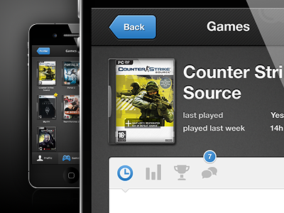
Steam App - Game Overview
3magine
Available for work
Follow
Following
Like
Get in touch
#1F1F1E
#4F4F4F
#F4F4F4
#9A9A9A
#C0CCC0
#4D8ABE
#BEB339
Download color palette
Continuing with the Steam App redesign. A sneak peek at the game overview screen.
app
blue
dark
ios
iphone
steam
View all tags
Posted on Jul 5, 2012
3,049
15
74
6
View feedback
3magine
Welcome to our design portfolio on Dribbble
Get in touch
More by 3magine
View profile
Previous
Next
Loading…
Loading…
Loading…