3D Pricing Page

Pricing-dribbble

33 Responses (page 1 of 2)

  1. Pro Dave Ruiz Dave Ruiz

    I have been working with the very talented Mason Yarnell and Julien Renvoye over at mixpanel.com and here is a concept for a pricing page that got axed, but I still enjoyed working on.

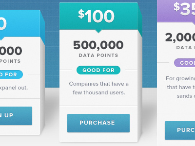
    The concept was, the pricing plans were 3D bars on a graph, and the larger the package was, the taller it stood.

    likes

    11 months ago

  2. Pro Adam Pickering Adam Pickering

    Not bad.. eh?

    likes

    11 months ago

  3. Pro Afraz Afraz

    WOW... Great idea. Really like it :)

    likes

    11 months ago

  4. Pro Trent McBride Trent McBride

    Whoooa super cool! Very well executed! But you're not using a single perspective point across each of the different packages!

    Just kidding. Really nice.

    likes

    11 months ago

  5. Pro Jake Mize Jake Mize

    Nice!

    likes

    11 months ago

  6. Matthew Wagner Matthew Wagner

    This is really nice man! Creative and clean! Works very well to show the different tiers. Nice work!

    likes

    11 months ago

  7. Pro Haziq Mir Haziq Mir

    +1

    likes

    11 months ago

  8. Pro Christian Ross Christian Ross

    A bar graph? How PowerPoint-ish of you. What is this 1997? Loser.

    Also, nice shot.

    likes

    11 months ago

  9. Pro Paresh Khatri ::::✈ Paresh Khatri ::::✈

    really nice :) @Dave Ruiz

    likes

    11 months ago

  10. Pro Mirco Moretti Mirco Moretti

    /• Smashing-3D •/

    I just put it in my personal » bucket dedicated to pricing tables…only great interface!!

    likes

    11 months ago

  11. Pro Kartik Mahant  Kartik Mahant 

    Sweet Mothe* Fuckin* Pixels :) Your a kingdom bro.

    likes

    11 months ago

  12. Pro Deepak Jose Deepak Jose

    nice concept.

    likes

    11 months ago

  13. Pro Creative Goat Creative Goat

    Looks very nice, we would like to see it in context :)

    likes

    11 months ago

  14. Pro Damian Hernandez Damian Hernandez

    Agree with @Creative Goat , also nice colors.

    likes

    11 months ago

  15. Pro Peter Blatchford Peter Blatchford

    love love love it!

    likes

    11 months ago

  16. Pro Mason Yarnell Mason Yarnell

    Very cool concept, @Dave! Keep rocking it. :)

    likes

    11 months ago

  17. Marisa Raskin Marisa Raskin

    Fun! Axed work is like the best...

    likes

    11 months ago

  18. Joel Smith Joel Smith

    What was the reasoning behind the choice not to go with this version?

    edit: missed a word

    11 months ago

  19. Pro kikillo kikillo

    sensacional

    likes

    11 months ago

  20. Pro Dave Ruiz Dave Ruiz

    @Joel Smith: Didn't fit the overall final direction of the new site.

    11 months ago

  21. Pro Julien Renvoye Julien Renvoye

    YOU are talented :)

    likes

    11 months ago

  22. Pro DPAM23 DPAM23

    Love it!

    likes

    11 months ago

  23. Pro Nate Ernst Nate Ernst

    Seems a little weird that they're on different planes at the bottom, seems like it messes with the scale?

    11 months ago

  24. Nol Franklin Nol Franklin

    Great work, Dave! That colour scheme is perfect!

    likes

    11 months ago

  25. Pro Dave Ruiz Dave Ruiz

    @Nate Ernst It would make sense if you saw the whole thing.

    11 months ago

keyboard shortcuts: previous shot next shot L or F like