Dc-2012

Text thinning

Text-thinning

15 Responses

  1. Pro Dc-2012 Dan Cederholm

    A workshop slide for discussing 'text thinning' via the text-shadow property in CSS.

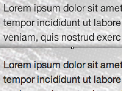
    Top: thinned, bottom: normal. Both in Safari.

    Some love it, some hate it. Sound off, dribbblers?

    over 2 years ago

  2. Pro Fumanchu Phineas X. Jones

    In this particular example it gives kind of a cool debossed look. I could see it being used to good effect.

    over 2 years ago

  3. Pro Si-tn Shaun Inman

    Depends on how it's used. At certain sizes or with the wrong contrast it can render the text unreadable. So "for" when used properly.

    over 2 years ago

  4. Me-super-steve-dribbble Steven Ray

    I think it's a awesome option. I'm sure it works better in some scenarios than others but I dig it.

    over 2 years ago

  5. Pro Dwwiltos Mat Marquis

    I'm in favor as called-for, but unless you know some voodoo that I don't (entirely likely), the text-shadow trick doesn't work in SL Safari. Word on the street is that webkit-text-stroke:1px transparent; is the new hotness.

    over 2 years ago

  6. Pro Sunglasses Jake Przespo

    +1 for Shaun's response.

    over 2 years ago

  7. Pro Dc-2012 Dan Cederholm

    Helpful responses so far, thanks.

    @Mat I've yet to upgrade to Snow Leopard, so that one I hadn't come across. Really interesting. Do you use -webkit-text-stroke in combination with text-shadow?

    over 2 years ago

  8. Dwwiltos

    over 2 years ago

  9. Cropped-hell-yeah Mark Otto

    I think the text thinning (anti-aliasing hack, letterpress effect, etc) is great, but you have to be careful.

    For the webkit-text-stroke trick, you'll notice an instant decrease in scrolling performance—especially when you have a lot o text on the page.

    over 2 years ago

  10. Pro Veer kern Patrick Haney

    I'm all for text thinning, but I do think it's not appropriate in some cases. And I hadn't heard about the issue with Snow Leopard's Safari, so I'm curious to find out more about that.

    over 2 years ago

  11. Pro Face_small Kyle Neath

    I'm all for text thinning, but beware it seems normal people hate it on white backgrounds (since "thinning" on dark backgrounds just seems to mean "render text the way it should be, OSX").

    When I rolled out text-thinning on http://github.com there was practically a revolt on twitter. People hated it. Ended up having to roll it back later that day.

    over 2 years ago

  12. Jasonrobb Jason Robb

    Text thinners... reducing your risk for heart attack, stroke, and blockages in your arteries and veins. Or something.

    over 2 years ago

  13. Pro Avatar-me-short-hair-256x256 Veerle Pieters

    +1 for it depends. It is true that it doesn't work on Snow Leopard in Safari. You have to use -text-stroke:1px transparent; }

    This doesn't work on mobile Safari so I disable it with this line.
    @media only screen and (max-device-width:480px) {body{-webkit-text-stroke:0 black;}}. Think I learned this trick from Steve Smith a while ago.

    over 2 years ago

  14. Pro Me-1 Mike Rundle

    One issue with using -webkit-text-stroke is that if you use it on large parts of your page your scrolling will slow down like crazy.

    over 2 years ago

  15. Pro 1f8f6ded95a14175acba6c272c967787_7 Philip Renich

    Dan, the comments I received about the text-shadow anti-aliasing I wrote about a few weeks ago received a lot of the same comments even though it was for the opposite problem (Windows not being smooth enough like Safari/Mac). You really need to take it on a case by case basis. (maybe you could take and modify the little test site I setup?)

    over 2 years ago

keyboard shortcuts: previous shot next shot L or F like