Looking good dude, nice and simple. The only thing that could be confusing here is the settings button with the arrow pointing up. With the delivering bar there it looks as though they are related. Also, what happened when the settings are active and the delivering bar pops up as well. Is this possible? Keep it up!
Hey @Karl Brightman, the settings are in a modal. On the background you see stuff happening. So, yeah :). Thanks for the feedback. It indeed looks like they are related. I'll take a good look again. Thanks!
You might consider changing the 'sign up for beta' interaction as you fill in your e-mail and click the button as more of a acceptance animation. Like the fill in bar disappears and get's replaced with the logo and a text saying thanks for signing up. I kinda pushed the button 3 times as I wasn't really sure if it got applied.
24 Responses
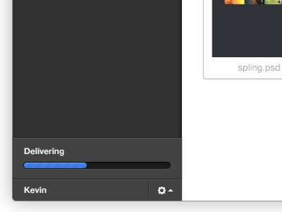
I thought I'd start showing some designs for the product we're making.
This is the status bar for when you're updating your gallery (and send to clients).
It slides in from under the user bar and disappears again when it reaches 100%.
11 months ago
Nice and clean! I'd love to see a full pixel version..
11 months ago
Looking good dude, nice and simple. The only thing that could be confusing here is the settings button with the arrow pointing up. With the delivering bar there it looks as though they are related. Also, what happened when the settings are active and the delivering bar pops up as well. Is this possible? Keep it up!
11 months ago
Hey @Karl Brightman, the settings are in a modal. On the background you see stuff happening. So, yeah :). Thanks for the feedback. It indeed looks like they are related. I'll take a good look again. Thanks!
11 months ago
Looks really cool. What do you think about putting 1px dark (almost black) shadow for labels and icon?
11 months ago
Pro
Mani
great work as always @Jonno Riekwel
11 months ago
Pro
Dhiren Adesara
nice !
11 months ago
Rebound
Delivering
by Victor Wanders
Due to the fact that this project uses a lot of gray tones and almost no colours at all... these elements really 'pop'! Like it alot.
- Maybe make the delivering bar less obtrusive and combine them (rebound) ... just a thought, don't wanna fuck with your design ;)
11 months ago
You might consider changing the 'sign up for beta' interaction as you fill in your e-mail and click the button as more of a acceptance animation. Like the fill in bar disappears and get's replaced with the logo and a text saying thanks for signing up. I kinda pushed the button 3 times as I wasn't really sure if it got applied.
:)
11 months ago
Surprised no one pointed this out, bottom left corner is pretty bumpy.
11 months ago
Pro
Ryno van Niekerk
the corner rounding is a bit off as Russ pointed out, overall its a nice design
11 months ago
Pro
Kartik Mahant
Lovely as always.
11 months ago
Pro
Danny Keane
Looking good @Jonno Riekwel I've noticed a slight shadow overflow with the loading indicator box in the bottom left, just throws things off a little.
http://cl.ly/HsFt
11 months ago
Looks great!
But what I would really like to know is who created the amazing illustrations on your site. :)
11 months ago
Pro
Kevin Jannis
Like it, it says Kevin at the bottom!
11 months ago
Pro
Simon Gustavsson
Nice! Although the grey stroke just makes the left part blurry, don't you think?
11 months ago
Pro
Creative Goat
We are loving the ship drawing over the live site, amazing!
11 months ago
very nice!
11 months ago
Pro
Joshua Mauldin
Did you know your homepage's ship looks like an upside-down, scary-as-all-hell clown? True story: here it is.
11 months ago
Pro
DPAM23
LOL @Joshua Mauldin !!
11 months ago
@Joshua Mauldin That's now on our office wall ;)
11 months ago
Pro
Joshua Mauldin
@Jonno Riekwel awesome! Life feels a little more complete now.
11 months ago
Can I get a beta pass?
10 months ago
Pro
Avadh B.S. Dwivedi
Looks cool... Inspired by Coda. Mail. Transmit.
8 months ago