Find designers
Designer search
Quickly find your next designer
Post a job
The #1 job board for design talent
Inspiration
Courses
UX Diploma
Learn UX design from scratch in 6 months
UI Certificate
12-week UI skill building for designers
Live interactive workshops
with design professionals
Jobs
Go Pro
Log in
Dribbble: the community for graphic design
Log in
Sign up
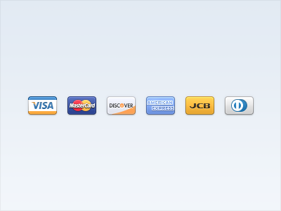
Credit cards
Ludwig Pettersson
Follow
Following
Like
#EAF0F6
#A4B4D0
#F4B749
#4365A7
#6193D2
#363E52
#BE5D3E
#E26B85
Download color palette
Happy 4th of July!
american express
credit cards
diners
discover
job
master card
visa
View all tags
Posted on Jul 4, 2012
7,512
4
116
5
View feedback
Ludwig Pettersson
Welcome to my design portfolio on Dribbble
More by Ludwig Pettersson
View profile
Previous
Next
Loading…