Find designers
Designer search
Quickly find your next designer
Post a job
The #1 job board for design talent
Inspiration
Courses
UX Diploma
Learn UX design from scratch in 6 months
UI Certificate
12-week UI skill building for designers
Live interactive workshops
with design professionals
Jobs
Go Pro
Log in
Dribbble: the community for graphic design
Log in
Sign up
Secret Dashboard - Notifcations
Zane David
Available for work
Follow
Following
Like
Get in touch
#F6F6F6
#4D4F51
#282829
#B5ACA2
#857873
#DBA55E
Download color palette
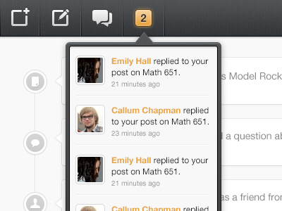
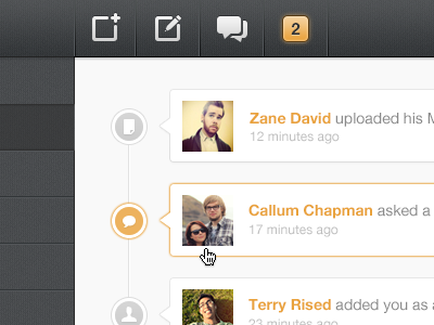
Concept for drop down notifications on the dashboard.
Larger image attached
Rebound of
Secret Dashboard
By
Zane David
class
dashboard
dropdown
feed
notifcations
post
school
search
social
timeline
ui
ux
View all tags
Posted on Jul 3, 2012
10,261
26
177
11
View feedback
Zane David
Get in touch
More by Zane David
View profile
Previous
Next
Loading…
Loading…
Loading…