CRM Project Page

Crm_project_small

1 Attachment

9 Responses

  1. Pro Jason Mayo Jason Mayo

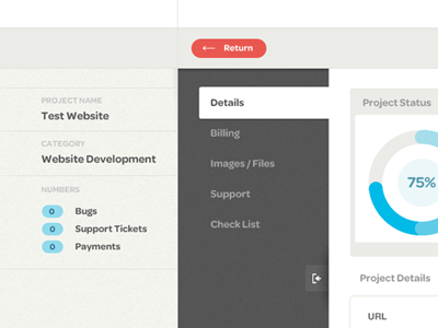
    Stage 1 of the "Project" detail page for Shape CRM.

    Features include a collapsable sidebar (Shot coming soon), interactive graph & tool tips.

    Theres a few things I want to change, but really liking the layout on this. Its not too complicated because our client base aren't very technical.

    View attachment for the full shot.

    likes

    11 months ago

  2. Pierre Georges Pierre Georges

    nice work !

    11 months ago

  3. Pro Samuel Couto Samuel Couto

    Very nice work! My only comment would be for the project status round progress bar. Why is it 3 shades of blue? Doesn't makes more sense just one color? Or each color refers to a project's stage?

    11 months ago

  4. Pro Jason Mayo Jason Mayo

    @Samuel Couto Yeah each bit states a part of the project. Generally in a Web Development project we go through stages such as "Design, Template, CMS, Debug" So each blue bit states what stage has been done.

    I should of mocked it up... But my idea is that if you hover a section it would tell you what it is, and if it's complete or not.

    Maybe im making it too complicated and it should just be one solid blue colour though huh! :)

    11 months ago

  5. Pro Luboš Volkov Luboš Volkov

    Really like those colors, very nice :) only thing i dont like is that progress bar: behind that soft blue you can see the darker one :) keep goin!

    11 months ago

  6. Pro Tom Medhurst Tom Medhurst

    love this, really nice work.

    11 months ago

  7. Justin Roberts Justin Roberts

    Beautifully simple.

    10 months ago

  8. Pro Quinton Pike Quinton Pike

    CLEAN

    5 months ago

  9. Ben Peck Ben Peck

    Very clean. I like 90% of it.

    // Feedback
    Its proven that users can read easier "label to label value" better when labels are right aligned. It requires less eye movement. So the content under the three sections on the right. I'd recommend the labels be right aligned and the content be closer to the label.

    My UX feedback. :)

    3 months ago

keyboard shortcuts: previous shot next shot L or F like