Updated Toggle and Main List - Flat UI

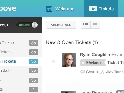
Updated this design a bit more last night, working today on cleaning up spacing to grids. Added a toggle for a rep to go online and offline. Slowing coming together!
Thoughts?
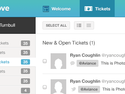
Updated this design a bit more last night, working today on cleaning up spacing to grids. Added a toggle for a rep to go online and offline. Slowing coming together!
Thoughts?


