the image within the orange border is not aligned also id make the corners of that border not rounded since you are not there is no other rounded element on this design as far as i can see and id give a bit more space between those two text but other than that it looks great, awesome color scheme and I like the pattern you used too... Great job.... im proud of you =)
6 Responses
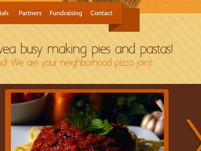
This is a piece of a Website Design I am creating for a fun Italian Restaurant in Dallas. Open for comments.
over 1 year ago
Pro
Sean McCabe
Welcome to Dribbble Taly =)
over 1 year ago
the image within the orange border is not aligned also id make the corners of that border not rounded since you are not there is no other rounded element on this design as far as i can see and id give a bit more space between those two text but other than that it looks great, awesome color scheme and I like the pattern you used too... Great job.... im proud of you =)
over 1 year ago
Very nice. I especially love the bold colors and the textures.
over 1 year ago
Pro
Sascha M. Trinkaus
Welcome Taly! Nice work :) Very fitting for an Italian restaurant.
over 1 year ago
thanks david and sascha :)
over 1 year ago