La Fades Monograms.


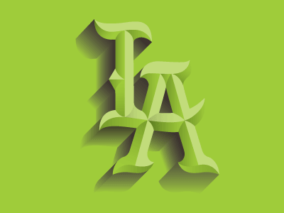

I swear I am done after this! Just wanted to try some gradient fades with my LA monogram. I hope you guys approve! Also, I will be making this into a font that includes solid, strokes and bevels.

I swear I am done after this! Just wanted to try some gradient fades with my LA monogram. I hope you guys approve! Also, I will be making this into a font that includes solid, strokes and bevels.


