Find designers
Designer search
Quickly find your next designer
Post a job
The #1 job board for design talent
Inspiration
Courses
UX Diploma
Learn UX design from scratch in 6 months
UI Certificate
12-week UI skill building for designers
Live interactive workshops
with design professionals
Jobs
Go Pro
Log in
Dribbble: the community for graphic design
Log in
Sign up
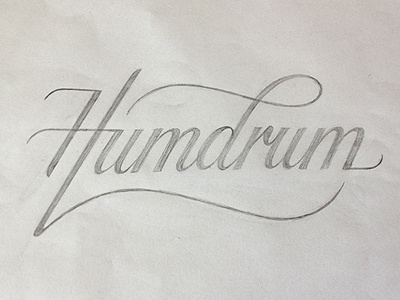
Humdrum logo (sketch)
Simon Ålander
Available for work
Follow
Following
Like
Get in touch
#D2D1CC
#C1BFC0
#85837D
#716F69
Download color palette
I'm working on a logo for a clothing brand called Humdrum Apparel and this is the initial sketch.
coffee made me do it
hand drawn
humdrum
lettering
logo
script
simon ålander
sketch
typography
View all tags
Posted on Jul 2, 2012
10,095
62
363
45
View feedback
Simon Ålander
Get in touch
More by Simon Ålander
View profile
Previous
Next
Loading…
Loading…
Loading…