Find designers
Designer search
Quickly find your next designer
Post a job
The #1 job board for design talent
Inspiration
Courses
UX Diploma
Learn UX design from scratch in 6 months
UI Certificate
12-week UI skill building for designers
Live interactive workshops
with design professionals
Jobs
Go Pro
Log in
Dribbble: the community for graphic design
Log in
Sign up
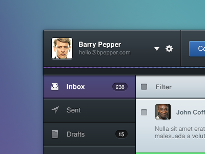
Flyaway mail app
Frantisek Kusovsky
Available for work
Follow
Following
Like
Get in touch
#252B30
#596A95
#CFD7DD
#5C97A6
#42455B
#8F955B
#6EE6A4
Download color palette
Some icons from awesome pack
http://www.icons4coffee.com/
app
email
inbox
ipad
mail
message
modern
new
photo
receive
web
website
View all tags
Posted on Jul 1, 2012
30,270
79
517
19
View feedback
Frantisek Kusovsky
Get in touch
More by Frantisek Kusovsky
View profile
Previous
Next
Loading…
Loading…
Loading…