First Rebound - Gatorade Logo Redesign

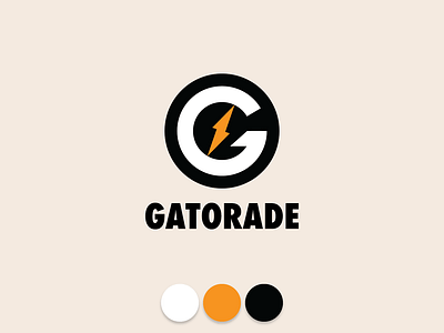
Saw the original on LinkedIn and had to join in on the fun with a rebound. I thought I'd do something a little bit more distinct for the "G". It's functional and stable, with a dynamic lightning core. The "G" will fit almost anywhere you need to attach a stick as it's a perfect circle which I though was a minor weakness of the more upright "G" they use now. Color scheme for this image is a bit retro, but rest assured, I tested it, and it has great flexibility with color. Might post more of that on social media later for demonstration purposes. Hope you like it!