Find designers
Designer search
Quickly find your next designer
Post a job
The #1 job board for design talent
Inspiration
Courses
UX Diploma
Learn UX design from scratch in 6 months
UI Certificate
12-week UI skill building for designers
Live interactive workshops
with design professionals
Jobs
Go Pro
Log in
Dribbble: the community for graphic design
Advance your career with a Professional Diploma in UX Design
Learn more
Log in
Sign up
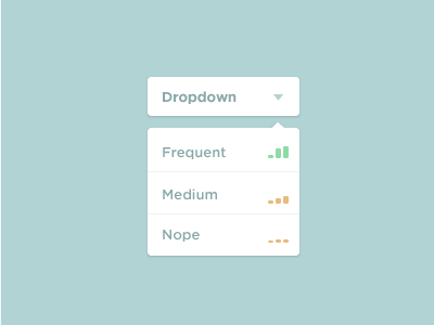
Simple Dropdown
Alex Penny
Available for work
Follow
Following
Like
Get in touch
#B1D3D4
#FEFEFE
#97B3B3
#8EDBA7
#E5BC7F
#EFD6AE
Download color palette
down
drop
dropdown
flat
simple
stats
ui
View all tags
Posted on Jun 30, 2012
58,588
200
862
20
View feedback
Alex Penny
Get in touch
More by Alex Penny
View profile
Previous
Next
Loading…
Loading…
Loading…