Find designers
Designer search
Quickly find your next designer
Post a job
The #1 job board for design talent
Inspiration
Courses
UX Diploma
Learn UX design from scratch in 6 months
UI Certificate
12-week UI skill building for designers
Live interactive workshops
with design professionals
Jobs
Go Pro
Log in
Dribbble: the community for graphic design
Log in
Sign up
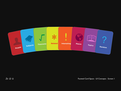
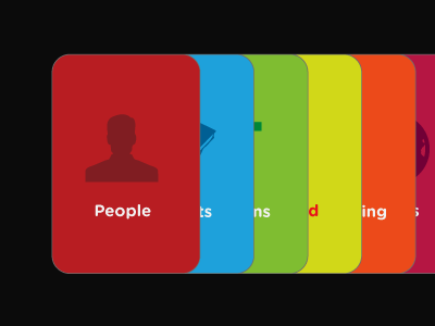
Card User Interface II
Darren Geraghty
Follow
Following
Like
#101010
#CE3736
#B3D031
#3C5CA8
#944B9F
#2AA9E0
#603E4E
#A0AD9A
Download color palette
Rebound of
Cards UI
By
Darren Geraghty
border
cards
interface
spectrum
spread
View all tags
Posted on Oct 6, 2010
7,088
19
175
8
View feedback
Darren Geraghty
More by Darren Geraghty
View profile
Previous
Next
Loading…