17 Responses

  1. Faheema Patel Faheema Patel

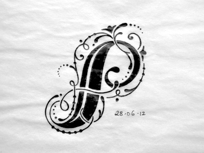
    I have been spending some time trying to get ideas for letters (yes I skipped a lot of letters after B haha), it's much harder than it seems! Not sure I'm too happy about this one, I feel like it doesn't have enough balance, it could read as a S too right? I might sketch another idea for this letter.

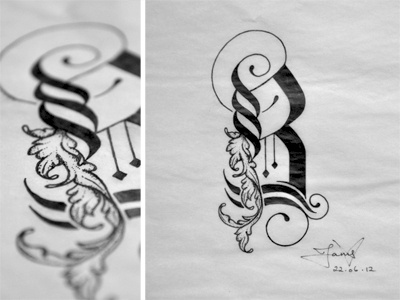
    During research I have been influenced from various art movements and it's not only from middle eastern art as it has been initially (although they do have very similar influences from each other), so my pieces will be hybrids of my interpretation of flourishes and font styles.

    likes

    11 months ago

  2. Arno Kathollnig Arno Kathollnig

    Sooo beautiful!!!

    likes

    11 months ago

  3. Pro Nikita Prokhorov Nikita Prokhorov

    BEAUUUUUUTIFUL.

    What are you using for paper type, pencils/pens, etc??

    likes

    11 months ago

  4. Faheema Patel Faheema Patel

    @Arno Kathollnig, @Nikita Prokhorov
    Aww thank you guys! you have really been encouraging, gives me the motivation to keep working at it.

    Well the paper I'm sketching on is horrible quality from a sketch book I have, I had to buy a new one. The new one I got is Daler Rowney, I love the paper texture, but I'm still sketching in the bad quality sketchbook since I started from there. My plan is to ink all the letters in the new A4 sketchbook on a bigger scale. The pens I'm using are staedtler pens, 0.3, 0.1 and 0.05, also using a marker to shade instead of wasting the pen ink. I'm using tracing paper for the 'final draft', tracing paper holds the ink much better and doesn't bleed.

    likes

    11 months ago

  5. Kishan Patel Kishan Patel

    Mmmmm.

    likes

    11 months ago

  6. Pro Joachim Vu Joachim Vu

    This P is perfectly readable to me. Maybe it looks less balanced than your A and B, but the letter structure wants that, or maybe that's because your flourishes follow your letter's curves, instead of creating contrast by frankly cutting them, filling some white space under the P bowl. But I'm saying that without offering any solution because I highly doubt I could do better ! Plus you set a very high standard with the perfect mixing of styles in your B ;) this one is my favorite for now !

    likes

    11 months ago

  7. Faheema Patel Faheema Patel

    @Joachim Vu haha are you kidding me? You could do better. Your Life Saver Piece is like amaaazing to me! Thanks a lot for your nice comment, it bugs me I think because I have also sketched other letters as well, I guess it doesn't fit in consistency. Maybe I'm just being picky. What I think is the challenge is to make each letter as impacting as the others, if one letter is weaker it definitely will stand out.

    11 months ago

  8. Anna Ropalo Anna Ropalo

    Just beautiful.

    likes

    11 months ago

  9. Faheema Patel Faheema Patel

    Thank you @Anna! ;)

    11 months ago

  10. Pro Francis Chouquet Francis Chouquet

    Really nice Faheema ! :) What kind of paper is that ? Seems to be really thin...

    likes

    11 months ago

  11. Faheema Patel Faheema Patel

    Thank you @Francis, it's tracing paper, but I do all my preliminary sketches on paper first before tracing

    11 months ago

  12. Claire Coullon Claire Coullon

    This one is beautiful, I don't see an 'S' in there at all (well, it would be a really weirdly shaped 'S'). The flourishes are so, so stunning – as always though. I love how picky you still are, haha.

    On another note, I love the lack of ink bleed on the tracing paper. Going to need to buy some..

    likes

    11 months ago

  13. Faheema Patel Faheema Patel

    @Claire Coullon Thank you! I asked my sister first before posting and she said it looked like an S, so I got worried. Haha I'll always be picky!

    It's definitely the easiest medium to work with, and when you do scan it, it shows up as black on a white surface background.

    likes

    11 months ago

  14. Claire Coullon Claire Coullon

    That's good to know for scanning. My (admittedly lousy quality) scanner always picks up all tons of specks and shadows from regular paper, even though they're never there in the original. Definitely seems like time to get some tracing paper, thanks!

    likes

    11 months ago

  15. I think the structuring of this one needs some more work. The lobe needs some fine tuning in terms of the roundness, also the top stem looks a little heavier in weight than the bottom, I think I may need to rotate it so that the top is at the bottom. Also need to fine tune the tail a little bit to make it rounder.

    11 months ago

  16. Robert De Leon Robert De Leon

    I love this.

    likes

    10 months ago

  17. Faheema Patel Faheema Patel

    Thank you @Robert glad you do! :)

    10 months ago

keyboard shortcuts: previous shot next shot L or F like