Find designers
Designer search
Quickly find your next designer
Post a job
The #1 job board for design talent
Inspiration
Courses
UX Diploma
Learn UX design from scratch in 6 months
UI Certificate
12-week UI skill building for designers
Live interactive workshops
with design professionals
Jobs
Go Pro
Log in
Dribbble: the community for graphic design
Log in
Sign up
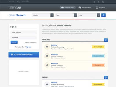
Job Board Website Design
Sunil Joshi
Follow
Following
Like
#F7F7F5
#4C535A
#AEB8C0
#578EC2
#F1C15E
#316AC4
#D86666
Download color palette
Working on Job Board website - attached full preview too - guys let me know your thoughts...
clean
graduate jobs
job
job board
jobs
job site
latest jobs
modern
search
simple
vacation work
web design
View all tags
Posted on Jun 27, 2012
9,098
20
64
9
View feedback
Sunil Joshi
Welcome to my design portfolio on Dribbble
More by Sunil Joshi
View profile
Previous
Next
Loading…