


Donate

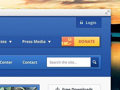
Here is right-top part of header. Client wants strong contrast for Donate button over background. Something is bugging me ( or maybe it's just not my day :] ) about this button which I can't name it, hope you can with your comments. Much appreciated!
Thanks, and you can follow me on Twitter for updates...


