Listing

1 Attachment

20 Responses

  1. Pro Paresh Khatri ::::✈ Paresh Khatri ::::✈

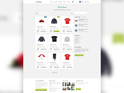
    Here is the listing page of the ecommerce theme :) let me know what you guys think?

    Checkout the bigger preview

    11 months ago

  2. Pro Suzie Creamcheese Suzie Creamcheese

    Looks very nice and clean. It's very nice to look at!

    Just a few remarks though:
    - The '$499' could use a lighter grey tone.
    - Also it's strikethrough isn't very visible.
    - What will th price look like if the item isn't in sale?
    - Your search bar doesn't fit the design. Maybe all it needs is rounded corners (like everything else in the design)
    - With a quick browse I spotted (only:P) 2 typos. "complete range of the products for all you needS" (add an S)
    and "Sort by" instead of "Short by".
    - Even though I like the wave effect (above the footer) I think you're using this too often in your designs, and it makes the all look alike.

    Hope this helps!

    likes

    11 months ago

  3. Pro Paresh Khatri ::::✈ Paresh Khatri ::::✈

    @Suzie Creamcheese hey thanks for such a details feedback and it will definitely help me a lot :) regarding wave effect Its only for this project not for any other... so may be I may be I think make a project of it so people get understand that this is the one project :)

    Thanks for your time and feedback I really appreciate it

    11 months ago

  4. Pro Andrey Maxim Andrey Maxim

    Awesome!
    What a font in sidebar titles?

    11 months ago

  5. Pro Dhiren Adesara Dhiren Adesara

    એ પરેશ ભાઈ આ તો ખુબજ ઉચ્ચ કક્ષા નું કામ છે
    સરળ અને સુંદર !

    11 months ago

  6. Pro krishnachaitanya krishnachaitanya

    great work mate! looks awesome and very clean!

    11 months ago

  7. Pro Mani Mani

    11 months ago

  8. Justin Roberts Justin Roberts

    Like it... reminds me of Pinterest a little. But thats ok :) ... Love your work man!

    11 months ago

  9. Vineeth  Vineeth 

    Did you tried Search box with same height as Sort panel? Nice work btw!

    11 months ago

  10. Pro Andrew Lucas Andrew Lucas

    I like it. I'd just avoid using Lorem Ipsum. Try and get some real content in there. Also not a fan of the brush type on the buttons. Other than that, love it.

    11 months ago

  11. Denis Cojemeachin Denis Cojemeachin

    Looks fantastic! I would remove all the buttons "add to cart". Simple solution is to display the button by on mouse over.

    11 months ago

  12. Pro Emrah Demirag Emrah Demirag

    cool ecommerce template design.

    11 months ago

  13. Pro Julia Khusainova Julia Khusainova

    I like clean, non-cluttered ecommerce designs with lots of space preliminary white, both as designer and customer.

    Great work, @Paresh Khatri!

    11 months ago

  14. Pro Max Litvin Max Litvin

    Nice & clean

    11 months ago

  15. Pro Suzie Creamcheese Suzie Creamcheese

    @Paresh Khatri , lol I had a few typing misses myself there xD.

    Regarding the wave effect, they might not be exactly the same, but very similar:
    http://dribbble.com/shots/527377-Mocao/attachments/37537
    http://dribbble.com/shots/515414-Upcoming-event-site
    http://dribbble.com/shots/449691-Hulala-Header

    Don't get me wrong. I like the waves, and I guess it could be your trademark, just be carefull that you don't start repeating yourself, because that would be a waste of your talent!

    :)

    11 months ago

  16. Pro Paresh Khatri ::::✈ Paresh Khatri ::::✈

    @Suzie Creamcheese aha I got you :) actually in event site that wasn't actually accepted so I removed it and made it simple :p also about hulala design that was for some other client and he insist me to make some curve header part for it so.. sometimes client really becomes so choosy for particular stuff... :) but I will try for sure to use less curves line onwards :) lol and if I use I wont post it lol...

    11 months ago

  17. Pro Creative Goat Creative Goat

    It's so fresh, we love it!

    11 months ago

  18. Andrey S. Rodrigues ☝ Andrey S. Rodrigues ☝

    very nice

    11 months ago

  19. Pro Finn Harries Finn Harries

    Looking awesome. Where are you selling the theme?

    11 months ago

  20. Pro Eduardo Santos Eduardo Santos

    My favourite from you. Looks great! ;)

    11 months ago

keyboard shortcuts: previous shot next shot L or F like