Responsive Retina Redesign - BrianBenitez.me

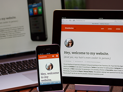

So, this isn't entirely ready—but here's what I've been working on. It's nearly there, just need to finish porting over the portfolio section...annnnd maybe write a blog post or two.
Anyway—future proof, bitches.
Don't dig around too deep yet.
Update: Decided to revert to my old site until I have the time to properly finish this one. I got a bit ahead of myself. Sorry.


