Find designers
Designer search
Quickly find your next designer
Post a job
The #1 job board for design talent
Inspiration
Courses
UX Diploma
Learn UX design from scratch in 6 months
UI Certificate
12-week UI skill building for designers
Live interactive workshops
with design professionals
Jobs
Go Pro
Log in
Dribbble: the community for graphic design
Advance your career with a Professional Diploma in UX Design
Learn more
Log in
Sign up
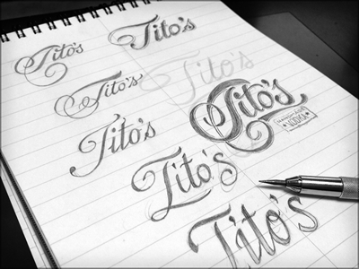
Toodles 33: Revising the script
Joshua Bullock
Available for work
Follow
Following
Like
Get in touch
#ECECEC
#A0A0A0
#191919
#606060
Download color palette
Practice makes perfect amirite? Just playing with some scripties and Tuesday is doodle day!
hand drawn
illustration
lettering
pencils
sketch
toodles
View all tags
Posted on Jun 26, 2012
4,683
29
234
27
View feedback
Joshua Bullock
Howdy howdy! 👋🤠 Lettering & illustrations by me
Get in touch
More by Joshua Bullock
View profile
Previous
Next
Loading…
Loading…
Loading…