Find designers
Designer search
Quickly find your next designer
Post a job
The #1 job board for design talent
Inspiration
Courses
UX Diploma
Learn UX design from scratch in 6 months
UI Certificate
12-week UI skill building for designers
Live interactive workshops
with design professionals
Jobs
Go Pro
Log in
Dribbble: the community for graphic design
Log in
Sign up
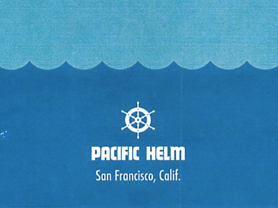
Statement of Work
Louie Mantia, Jr.
for
Pacific Helm
Available for work
Follow
Following
Like
Get in touch
#216FA6
#57ABC9
#154474
#F0F8FA
#A2C7DC
Download color palette
This is what our Statement of Work looks like!
Full size
design
helm
pacific
statement
work
View all tags
Posted on Jun 26, 2012
4,737
6
134
18
View feedback
Pacific Helm
Get in touch
More by Pacific Helm
View profile
Previous
Next
Loading…
Loading…
Loading…