Untitled Typeface

Newfontdribbble

8 Responses

  1. Patrick Steele Patrick Steele

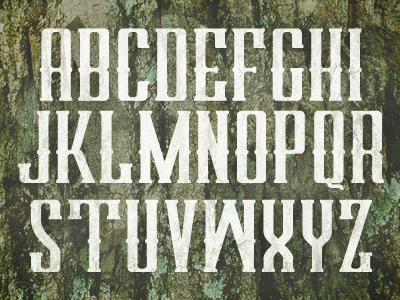
    A draft of the typeface I'm working on right now. Still have to do numerals, punctuation, and special chars. I'm thinking about including an overlay font for some of the common things I do to this kind of type (duotone, bevels, etc).

    How's everybody feel about it? Some things I'm not sure about:
    1) The Q
    2) Whether to put bulges/middle serifs on the D, V, and Z.

    likes

    12 months ago

  2. Roberto Torres Roberto Torres

    Nice. The tail on the Q doesn't seem to go with the rest of the text... I would put the bulges on D,V and Z. (just my 2ยข)

    12 months ago

  3. Dane Dane

    I'm likin' where this is going. I think bulges on the D, V and Z would certainly fit in with the rest.

    12 months ago

  4. Claire Coullon Claire Coullon

    Looks good so far, I love how tall the characters are! Wonderful serif style as well. The sense of rhythm in that first line in particular looks great. I like the shape of the 'Q' a lot, although I would love to see the tail heavier/more prominent as it gets lost a little at the minute. (Either that or test one coming out to the right, if you don't want to affect your line height).

    I'd definitely put the middle serifs on the 'D' (at least on the left stem). I don't mind them missing on 'V' and 'Z' since those are shapes are pretty different anyway.

    A couple of other things I noticed: I'd suggest bringing in the 'feet' of the 'W' (so that your outer strokes are diagonal) as it feels like it's stretching weirdly at the minute. The 'S' feels a bit awkward too, I think because it has a smooth junction at the top of the diagonal but then an angled one at the bottom. The 'N' (and to a lesser extent, the 'M') feels very heavy as well, perhaps try thinning the diagonal?

    Looking forward to following the progression!

    likes

    12 months ago

  5. Patrick Steele Patrick Steele

    @Claire Coullon spot on, especially about that W. Definitely taking all of that advice.

    12 months ago

  6. 12 months ago

  7. Christopher Magruder Christopher Magruder

    I'd buy it as it!

    12 months ago

  8. Derek Munn Derek Munn

    The new 'W' in the rebound is where it's at. Looking good! Keep going with it.

    6 months ago

keyboard shortcuts: previous shot next shot L or F like