iOS Icon ver2

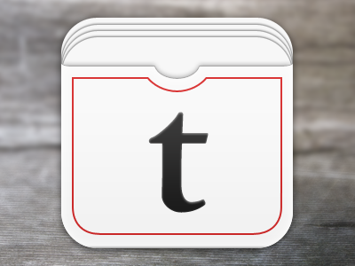
Made a bunch of corrections and added some depth to the icon for my (not so) super secret project. Think I'm getting closer, any critiques are appreciated.
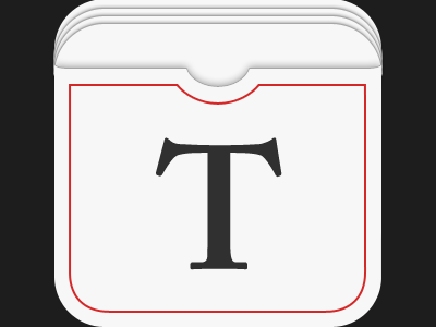
Made a bunch of corrections and added some depth to the icon for my (not so) super secret project. Think I'm getting closer, any critiques are appreciated.


