Find designers
Designer search
Quickly find your next designer
Post a job
The #1 job board for design talent
Inspiration
Courses
UX Diploma
Learn UX design from scratch in 6 months
UI Certificate
12-week UI skill building for designers
Live interactive workshops
with design professionals
Jobs
Go Pro
Log in
Dribbble: the community for graphic design
Advance your career with a Professional Diploma in UX Design
Learn more
Log in
Sign up
Mentor - Search
Conway Anderson
Available for work
Follow
Following
Like
Get in touch
#F7F6F7
#B8BDD3
#D7B0AF
#A3A2A2
#777575
#18100F
#4F3333
Download color palette
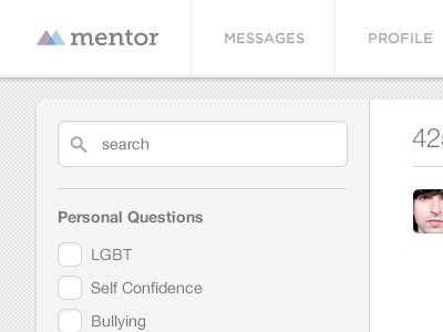
More from the Angel Hack demo I am working on
http://mentorim.herokuapp.com/
angel hack
ui
ux
web design
View all tags
Posted on Jun 24, 2012
6,002
29
163
8
View feedback
Conway Anderson
Get in touch
More by Conway Anderson
View profile
Previous
Next
Loading…
Loading…
Loading…