Chrome and Code

Chrome_and_code

10 Responses

  1. Pro Prathyush Prathyush

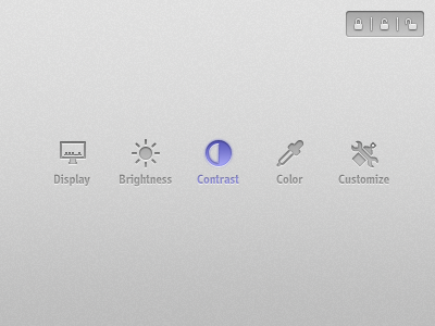
    Icons for an upcoming interaction prototype. This shot marks the end of me pushing static pixels on screen. Time to set things in motion.
    ---
    This design session was powered by dosas and tea made by my mother and Dev D OST.

    likes

    11 months ago

  2. Misha Nesoleniy Misha Nesoleniy

    nice!

    11 months ago

  3. Pro Paresh Khatri ::::✈ Paresh Khatri ::::✈

    Nice work Prathyush :) but my 2cents if it helps to make it better icons get bit blurry on click... :(

    likes

    11 months ago

  4. Michiel de Graaf Michiel de Graaf

    Not really liking the 'Customize' icon.

    Might help a bit if you increase the space between the wrench and the spray can.

    11 months ago

  5. Pro Kartik Mahant  Kartik Mahant 

    DOSA :) haha Seriously my favorite recipe. Icons look gorgeous.

    11 months ago

  6. Pro Mani Mani

    nice job man.

    11 months ago

  7. Pro Prathyush Prathyush

    @Paresh Khatri It's the outer glow bleeding through. I thought it would be a focus cue. But if it's contributing more towards making the icon look blurry, I would surely remove it.

    @Michiel de Graaf I hadn't actually tried the 2px gap. Let me try it.

    @Kartik Mahant ✦✦✦ Dish not recipe. Not my favourite, but it's been a long time since I have eaten something made by my mother ;)

    @All Others Thanks a lot for the appreciation.

    likes

    11 months ago

  8. Pro Dhiren Adesara Dhiren Adesara

    Looks Great !

    11 months ago

  9. ♜ Monsieur Didi ♜ ♜ Monsieur Didi ♜

    the icons i love but that click state, ehhhh not so much lol

    likes

    11 months ago

  10. Pro Prathyush Prathyush

    @Didi  Medina Agreed, that needs more work.

    likes

    11 months ago

keyboard shortcuts: previous shot next shot L or F like