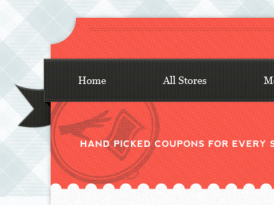
Good looking!
My main concern would be to the "Top Stores" area. Since the ← and → arrows will scroll through the top stores area shouldn't they be the nearest possible to that part/area/block of the design? The way it is now it makes it looks that clicking those, it will slide the whole page.
Oh, and I think the "go to top" link should be a bit less eye catchy. The way you have it it makes it more prominent than the "Activate this Deal" button, that in this case is what really matters, right?
Top notch work bro. Did you consider the navigation fonts are bit too small ? I think you can work on that, maybe Capitalize it or use come condensed and tall fonts for that.
Overall I love it. However, I have a few comments/questions. No love for 1024x768 anymore? Just curious if you no longer design for that resolution. Also why not put the 'view all' button for 'Top Stores' in that centered divider beneath it that currently has an emblem? Where it stands now is a bit disconnected from 'top stores' and kinda gets lost. It also throws that nice centered title a little off balance. Contextually that move would make sense too, as you view a bunch in the slide show, the next step if you don't see what you like might be to head down the page. It implies a more clear user path "look in the slider first, and if you don't see something you want, then view all of the top stores". Just a thought. Great stuff man!
Thanks for that suggestion @Chris Obermiller definitely going to give that a shot on the final round. Also not really designing much for 1024 these days. Usually going with an 1140px grid. Seems to be doing just fine
21 Responses
Pro
Forefathers™
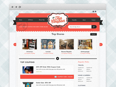
Homepage design for coupon / deals site The Top Coupon.
This was a collaboration with the great @Emir Ayouni | Growcase| Growcase handling the logo and icon duties :)
I ended up applying quite a few of the suggestion that were given on the last shot of this and they helped a ton so thanks!
11 months ago
Pro
Jason Harrop
Looks really good! Very clean. :)
11 months ago
Pro
Emir Ayouni
Oh man, you make it look guuuud.
11 months ago
Pro
Nemanja Jovanovic aka Frac...
instantly feel Jonden's touch on this,nice work man once again!
11 months ago
Pro
Forefathers™
Aw you guys da bestest!
11 months ago
Pro
Grzegorz K. G. Gilewicz
Yay, awesome header's checked background!
11 months ago
Now THAT is a much better ribbon treatment.
11 months ago
Pro
Sean Farrell
Looks great!
11 months ago
Pro
Shaun Moynihan
Nice! Keep it up man, you're killing it.
11 months ago
Pro
Mani
great work @Jonden Jackson
11 months ago
Pro
Sunil Joshi
Love the pattern and overall design !
11 months ago
Pro
Samuel Couto
Good looking!
My main concern would be to the "Top Stores" area. Since the ← and → arrows will scroll through the top stores area shouldn't they be the nearest possible to that part/area/block of the design? The way it is now it makes it looks that clicking those, it will slide the whole page.
Oh, and I think the "go to top" link should be a bit less eye catchy. The way you have it it makes it more prominent than the "Activate this Deal" button, that in this case is what really matters, right?
11 months ago
Pro
Kartik Mahant
Top notch work bro. Did you consider the navigation fonts are bit too small ? I think you can work on that, maybe Capitalize it or use come condensed and tall fonts for that.
Everything else looks ace.
11 months ago
Pro
Dámaso Benítez
Ohh actual pixel is much improved.
It is mounted on Wordpress?
11 months ago
one of the sexiest bg's ever.
11 months ago
Pro
Alexandre Naud
Great use of patterns. This is TOP man !
11 months ago
Slayed it, bro.
11 months ago
Pro
Forefathers™
Thanks for the love everyone :D
11 months ago
Pro
Nick Sloggett
Awesome work mate!
11 months ago
Pro
Chris Obermiller
Overall I love it. However, I have a few comments/questions. No love for 1024x768 anymore? Just curious if you no longer design for that resolution. Also why not put the 'view all' button for 'Top Stores' in that centered divider beneath it that currently has an emblem? Where it stands now is a bit disconnected from 'top stores' and kinda gets lost. It also throws that nice centered title a little off balance. Contextually that move would make sense too, as you view a bunch in the slide show, the next step if you don't see what you like might be to head down the page. It implies a more clear user path "look in the slider first, and if you don't see something you want, then view all of the top stores". Just a thought. Great stuff man!
11 months ago
Pro
Forefathers™
Thanks for that suggestion @Chris Obermiller definitely going to give that a shot on the final round. Also not really designing much for 1024 these days. Usually going with an 1140px grid. Seems to be doing just fine
11 months ago