One of the best iPhone UIs I've seen in a while! Really nice work @João!
Only a couple of things that I think it will improve it:
The "on" slider label to white instead of green.
I'd make the ribbon with the edges a bit rounded, since the design is quite rounded looking throughout it.
And I'd lose that black element on the middle tab of the card. At the top makes sense, but on the bottom it makes look that the tab is selected or something...
13 Responses
Flight info from the Official App of the Portuguese Airports. Made for iPhone, iPad, Android Phones and Tablets at Innovagency.
Get the app: http://itunes.apple.com/us/app/ana-portuguese-airports/id533213638?mt=8
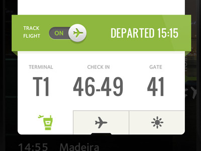
Full image attached. ;)
12 months ago
very clean design..good work.
12 months ago
Usability Design… shining concept.
12 months ago
One of the best iPhone UIs I've seen in a while! Really nice work @João!
Only a couple of things that I think it will improve it:
The "on" slider label to white instead of green.
I'd make the ribbon with the edges a bit rounded, since the design is quite rounded looking throughout it.
And I'd lose that black element on the middle tab of the card. At the top makes sense, but on the bottom it makes look that the tab is selected or something...
12 months ago
Amazing details Joao. Looking really good!
12 months ago
Cool!
12 months ago
nice work @João Oliveira Simões
12 months ago
Thank you all for your nice comments. This was made with my awesome team (@topesm @kalaverapt) at Innovagency. :)
12 months ago
Clean, flat, and great bold typography. Nice!
12 months ago
Great job, have used the real thing and can honestly say you've done a beautiful job.
11 months ago
Thanks Filipe. I'm glad you like it. We are working on the updates ;)
11 months ago
amazing work.
11 months ago
Thanks @Corey Michaud!
11 months ago