Looks stunning. Although the glow and shine could be toned down a bit (the record has 7 shine points). The front perspective seems off, but it would be hard to keep the 'Grundig' plate if you would bend it more to the front.
That's my two cents. Love it, wish I could make something like this.
19 Responses
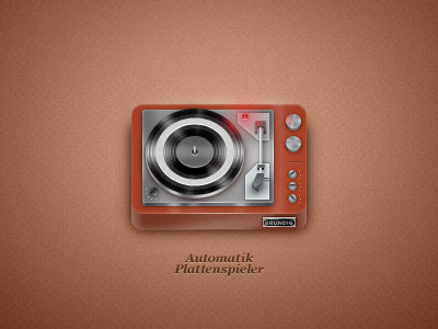
Trying out some icon design. :)
You can now, holy crap, snatch the PSD from 365psd! http://365psd.com/day/203/
over 2 years ago
Pro
Prathyush
Woah, lovely job on this one. Not sure about the inner ring of the Vinyl, shouldn't it be some more near to the pole ? Keep making more ;)
over 2 years ago
Pro
Pedja Rusic
Yeah a bit to the topish xD
I say a good slap at softfacade lol
over 2 years ago
Thanks guys, you're both so skilled!
Err, I don't get it Prathy... The inner ring? The little black hole where pole stands? :)
@Pedja I like it vintage, heh.
over 2 years ago
Pro
Ted Goas
Crazy amount of detail! That's a lot of glow for a tiny red light.
over 2 years ago
Pro
Prathyush
I meant the diameter of the inner circular hole in the needs to be less, so that the circumference will be closer to the pole
over 2 years ago
Ahh, okay I get it. :) Yes, I realize that the vinyl would spin wackily the way it is now, haha!
@Ted Lol, thanks lot! Yeah, the glow is exaggerated, but I wanted the red specular on the vinyl so badly...
over 2 years ago
@Ted that's what I told him! :) Very cool and toy-ish. I really love this kind of things with simplified detail and stuff.
over 2 years ago
Pro
Simon Gustavsson
Sweet.
over 2 years ago
Pro
Michael Spitz
Super nice!
over 2 years ago
Love your work Michael! Thanks!
over 2 years ago
beautiful!
Tried making the light at the front bit a bit more subtle? maybe make it overlay instead of normal/screen?
over 2 years ago
@Ed the light at the front? The 1px highlight on the edge of the bottom wooden thing?
THX!
over 2 years ago
this bit: http://cl.ly/ba7970d6e2c769d42df0
over 2 years ago
Ahh that one. Well I feel it would look too empty without it..
over 2 years ago
Looks stunning. Although the glow and shine could be toned down a bit (the record has 7 shine points). The front perspective seems off, but it would be hard to keep the 'Grundig' plate if you would bend it more to the front.
That's my two cents. Love it, wish I could make something like this.
over 2 years ago
Thanks norwegian bro!
Perspektivet er ment for å være slik det er, men glowen er kanskje litt overdreven ja.
Takk!
over 2 years ago
Pro
Joshua Sortino
Neat!
over 2 years ago
Pro
Davlikanoff Design
cool work
almost 2 years ago