@Jack Bingham it is 1 big button, you can tap anywhere on that button. I wanted to give a different taste and better focus on "facebook" wording there by giving a slightly more solid bg.
This is looking nice, but @Oykun Yilmaz that arrow.. come on man.. ? Not consistent with anything else on the screen, it's not a matter of taste :) Looks like it was cut ruffly out of the cardboard.
17 Responses
Pro
Oykun
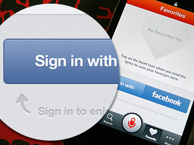
For some reason, if you don't have any favorite song, this is the screen you will see. You also have real pixels here.
Feedbacks are much appreciated! More to come soon and you can follow me on Twitter for updates...
11 months ago
Pro
Luboš Volkov
Really like yours soft textures and colors! :) Real pixels?
11 months ago
Pro
Remko Dijksma
nice
11 months ago
Pro
Dhiren Adesara
nice eeee !
11 months ago
Pro
Mani
clean.
11 months ago
Pro
Jack Bingham
Is that Sign In section two buttons so you can switch what service you sign in with — or is it just one button?
11 months ago
nice!
11 months ago
Very nice like always! I need to remember to hire you for the upcoming festicket apps !
11 months ago
Pro
Tanveer Junayed
Nice work. Not liking that arrow tho :s
11 months ago
Pro
Oykun
wow, so many comments already! Thanks folks!
@Luboš Volkov attached.
@Jack Bingham it is 1 big button, you can tap anywhere on that button. I wanted to give a different taste and better focus on "facebook" wording there by giving a slightly more solid bg.
@Jonathan Younes haha thanks :)
@Tanveer Junayed fair enough :) "design" is very subjective thing. One likes, one hates, it is all about taste...
11 months ago
Pro
Tanveer Junayed
Yes you're right mate!
11 months ago
Pro
Joao Pires
This is looking nice, but @Oykun Yilmaz that arrow.. come on man.. ? Not consistent with anything else on the screen, it's not a matter of taste :) Looks like it was cut ruffly out of the cardboard.
11 months ago
Pro
Emrah Demirag
looks great.
11 months ago
Pro
Murat Mutlu
YES!!!
that is all.
11 months ago
Looks great! Wondering if the "Favorite" button at the bottom should actually be "Favorites" to keep it consistent with the rest of the text?
11 months ago
Pro
Virgil Pana
I really like the whay this app is comming out. keep up the good work.
11 months ago
Pro
Oykun
@Joao Pires :) Thanks for honest comment.
@Scott Burgess Thanks, I'm gonna mention that to client.
@Craig Reville Thanks, I updated attachment with new revised version.
11 months ago