Nice man, I was intrigued as to what that little sketch would grow up to be. You done well fine sir.
And I could go either way on the sky. It may look a bit odd if the roof was too much taller, and if you raised the entire building, you'd lose your sign sitting on your 1/3 axis.
@Daryl Ginn@Jeffrey Jorgensen This is the first concept which was rejected by the client. The final one will be a bit different, but I think the height of the building will remain the same. Thanks for the feedback :)
25 Responses
Pro
Dash
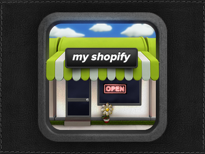
One of the proposed concept/idea. Final version coming soon.
follow me here for updates on this project.
11 months ago
Pro
Daryl Ginn
Good work.
Personal opinion: I think you should get rid of the sky and make the shop taller.
11 months ago
Pro
Jeffrey Jorgensen
Nice man, I was intrigued as to what that little sketch would grow up to be. You done well fine sir.
And I could go either way on the sky. It may look a bit odd if the roof was too much taller, and if you raised the entire building, you'd lose your sign sitting on your 1/3 axis.
11 months ago
Pro
jonathan olsen
Nice outcome! But I agree with @Daryl Ginn but I'd like big version!
11 months ago
Pro
Dash
@Daryl Ginn @Jeffrey Jorgensen This is the first concept which was rejected by the client. The final one will be a bit different, but I think the height of the building will remain the same. Thanks for the feedback :)
11 months ago
Pro
Dash
@jonathan olsen I'll try that and see what it looks like.
11 months ago
Pro
Alexander Awerin
Like everything but flower.
11 months ago
rejected? ... these laities ! ;) Nice work man !
11 months ago
Pro
Dash
@Alexander Jenni - but for good reason. The final design is way better :)
11 months ago
Pro
Mani
nicely done.
11 months ago
Pro
Pedro García
Great as always. I would pay for a video of how yo do that!
11 months ago
Pro
Stephen Dyson
Ridiculously good once again.
11 months ago
Pro
Roy
is this 3d?
11 months ago
Pro
buatoom
lovely
11 months ago
Pro
Tobia Crivellari
Love it!! :-) @Dash
11 months ago
Pro
Sam Muntean
Good start, try maybe other colors, like red and orange for carpets? :) And the border needs some retouch. Cheers :)
11 months ago
Pro
Andrea Cau
Really beautiful icon!
11 months ago
Love it but I would go without that "concrete" border and maybe even sky. Shop all the way.
11 months ago
Pro
Zach Inglis
Agree about making it taller. The type just doesn't sit well in it's current form for me either.
Looking great! :)
11 months ago
great job
11 months ago
Pro
Damian Hernandez
Love the textures and the effect of the sign “open”. Nice work Dash.
11 months ago
Pro
Joseph Liu
Love It! And maybe the gray frame is not necessary :)
11 months ago
Pro
Dash
@Christopher Paul Thanks, I'll sure keep that in mind.
11 months ago
Pro
krishnachaitanya
looks awesome! great work mate!
11 months ago
Rebound
MyShopify Icon (Final)
by Dash
Final version, let me know what you think.
10 months ago