


Web UI

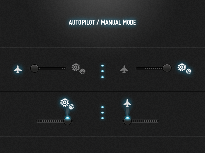
UI design for a slider that triggers autopilot / manual mode in my site. I might choose the first one due to size constraints.
UI design for a slider that triggers autopilot / manual mode in my site. I might choose the first one due to size constraints.


