Archive: Video Game Database

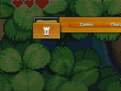
Working away on a quirky website nav layout. Going for something retro with the Atari wood veneer, the scan line TV effect background... and combining it with something web 2.0 with the buttons etc. Pop-out drawer pushes the 'database' aspect at you a little more, plus I think it's fun :)
P.s. my first dribbble since I was 2 years old! sweet.


