search results

Screen_shot_2012-06-17_at_11

4 Responses

  1. Gadzhi Kharkharov Gadzhi Kharkharov

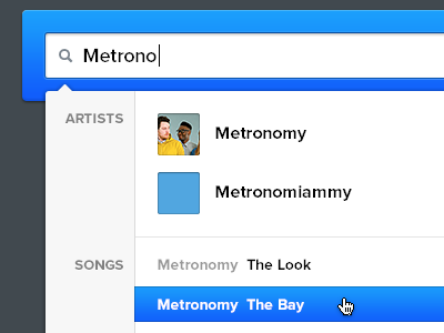
    Another piece from the music app. The search field is highlighted like this and has nothing else around when you enter the site.

    11 months ago

  2. Pro Anthony Lane Anthony Lane

    Something about the asymmetrical margins around the labels (Artists, Songs) is bothering me. Otherwise it's a nice way of sorting.

    11 months ago

  3. Gadzhi Kharkharov Gadzhi Kharkharov

    @Tony Lane Thanks) The labels are aligned to right, mostly inspired by OS X Spotlight, btw :)

    11 months ago

  4. Pro Marcello Manso Marcello Manso

    Everything with metronomy is damn right.

    likes

    11 months ago

keyboard shortcuts: previous shot next shot L or F like