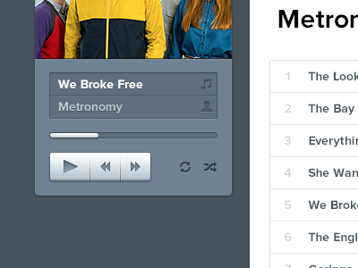
Playing with something dark

Screen_shot_2012-06-15_at_1

11 Responses

  1. Pro Haziq Mir Haziq Mir

    The song title and artist thingy looks like a field to me. Also, play button is too wide if compared to the other icons, I think!

    Rest is perfect :)

    11 months ago

  2. Pro Jack Bingham Jack Bingham

    Love the 3D effect on the controls. Really tactile.

    likes

    11 months ago

  3. Ryan Collins Ryan Collins

    Love how it looks. However, I'm used to player controls being rewind, play, then fast forward. Not play, rewind, then fast forward. It just looks so funny to me the way it is. Other than that, beautiful work as usual. :)

    likes

    11 months ago

  4. Pro Zaharenia Atzitzikaki Zaharenia Atzitzikaki

    I just can't get over how crisp it all looks. No constructive criticism by me, sorry.

    *jaw dropped*

    11 months ago

  5. Pro Gijs Rogé Gijs Rogé

    I like the fact that the play Icon is more prominent. Maybe remove the line between the song and the artist.

    But overall, very shiny :D

    11 months ago

  6. Pro Dhiren Adesara Dhiren Adesara

    cool !

    11 months ago

  7. Pro Mani Mani

    nice.

    11 months ago

  8. Alex Pascal Alex Pascal

    Love the buttons! Great look to them. ;)

    11 months ago

  9. Andrey S. Rodrigues ☝ Andrey S. Rodrigues ☝

    simply nice :)

    11 months ago

  10. Pro Jan Vu Nam Jan Vu Nam

    Very nice!

    11 months ago

  11. Pro Daryl Ginn Daryl Ginn

    I love it. I would really love it if you were to have put the play button in between the skip buttons though.

    likes

    11 months ago

keyboard shortcuts: previous shot next shot L or F like