Find designers
Designer search
Quickly find your next designer
Post a job
The #1 job board for design talent
Inspiration
Courses
UX Diploma
Learn UX design from scratch in 6 months
UI Certificate
12-week UI skill building for designers
Live interactive workshops
with design professionals
Jobs
Go Pro
Log in
Dribbble: the community for graphic design
Log in
Sign up
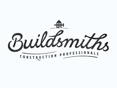
Buildsmiths
Luke Ritchie
Available for work
Follow
Following
Like
Get in touch
#F8FCFF
#252526
#3F3F40
#BDBFC2
#9E9FA1
#7D7E81
Download color palette
Logo I've been crafting recently. had like a milllion variations
black
branding
design
icon
illustration
lettering
logotype
mark
texture
type
typography
vector
white
View all tags
Posted on Jun 15, 2012
2,735
16
180
22
View feedback
Luke Ritchie
Get in touch
More by Luke Ritchie
View profile
Previous
Next
Loading…
Loading…
Loading…