Find designers
Designer search
Quickly find your next designer
Post a job
The #1 job board for design talent
Inspiration
Courses
UX Diploma
Learn UX design from scratch in 6 months
UI Certificate
12-week UI skill building for designers
Live interactive workshops
with design professionals
Jobs
Go Pro
Log in
Dribbble: the community for graphic design
Advance your career with a Professional Diploma in UX Design
Learn more
Log in
Sign up
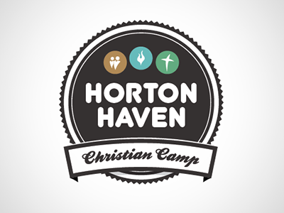
Horton Haven Logo
Aaron Harlow
Follow
Following
Like
#F5F5F5
#322E2E
#BAC4B9
#433E3D
#5E5B5A
#64B4A1
#A29F9F
#9C8B61
Download color palette
Logo for a local Christian Camp. Any and all feedback welcome.
camp
identity
logo
View all tags
Posted on Oct 1, 2010
925
3
24
3
View feedback
Aaron Harlow
More by Aaron Harlow
View profile
Previous
Next
Loading…