Strawberry Practice

Preview

1 Attachment

30 Responses (page 1 of 2)

  1. Pro Ollin Ollin

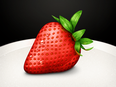
    Some lighting practice I've been working on, trying to get the hang of photorealism. Feedback and advice is great!

    Fullview
    Download

    likes

    12 months ago

  2. Pro Thom Thom

    WOW! it's hard to give feedback on a masterpiece but I'll give it a go...
    maybe the red of the strawberry is a bit flat, by adding some kind of noise or maybe a slight texture the strawberry will get a bit more depth.
    Though, you did a great job man! Keep rocking! :D

    likes

    12 months ago

  3. Shimi Joby Shimi Joby

    Awesome :)

    likes

    12 months ago

  4. Jani Muikku Jani Muikku

    Nice one! Think you should add some more detail, like fibers from the seeds ("strawberry hair").

    likes

    12 months ago

  5. Emanuel Sá Emanuel Sá

    Lovely work.

    I'd give it a bit more volume on the top (highlights/shadows). The bottom is very well done, but on the top we can notice it is a 2D composition.

    likes

    12 months ago

  6. Romain Lefebvre Romain Lefebvre

    Really well done.

    Here is a feedback : I think the bottom right part of the strawberry looks curiously glossy.
    Otherwise, the whole image looks awesome.

    likes

    12 months ago

  7. Pro Gert Jan Lodder / Pixellod Gert Jan Lodder / Pixellod

    Looks great, though I agree with @Emanuel Sá.

    12 months ago

  8. Pro Eli Schiff Eli Schiff

    Detailed all the way down to 16px! Color coming off of the leaves is just great. Using this for my 3D program: http://cl.ly/3s2V003k161g3k343L2c

    likes

    12 months ago

  9. Artem Korolenko Artem Korolenko

    Awesome work. I like this reflection.

    12 months ago

  10. Peter Burdette Peter Burdette

    I agree with @Thom. The top of the strawberry looks a bit flat but it still looks amazing. Great work on the green part at the top of the strawberry!

    likes

    12 months ago

  11. Uri Kelman Uri Kelman

    Looks delicious.

    11 months ago

  12. Pro Morcha Morcha

    sweet

    11 months ago

  13. Pro Kyle Adams Kyle Adams

    It's a bit flat in the middle, as others have pointed out. Also the very small amount of water only on the top is a bit odd. Great overall though!

    11 months ago

  14. Pro Yoga Perdana Yoga Perdana

    Wow

    11 months ago

  15. Pro Prekesh Chavda Prekesh Chavda

    Yes. The reflection on the leaf and the water droplets - fantastic

    likes

    11 months ago

  16. Joan Andrade Joan Andrade

    Wooow... I want to eat this strawberry .. Fantastic job, great detail and well excecuted..

    11 months ago

  17. Pro Yael Miller Yael Miller

    More realism may be achieved by:
    - creating a sharper 'shine' zone on the top
    - adding a lighter zone right at the edge after it gets darker (top left zone) to convey ambient reflective light from surroundings

    I'm not an artist, but I hire plenty :)

    11 months ago

  18. Pro Hemant Hemant

    beautiful :D

    11 months ago

  19. Pro Craig Erskine Craig Erskine

    Looks really well done. I recommend taking a look at @creativemints attempt... it might help: http://drbl.in/cOmB

    11 months ago

  20. Pro Alex Parker ⇢ ☁ Alex Parker ⇢ ☁

    I think you have an amazingly detailed image here. Your attention to the details is great. I also feel that "something" is making the strawberry flat, and many have suggested some alterations in the shading/highlighting/texturing. But i think it's actually the pattern of the seeds that is working against you. It's the perspective of the impressed seeds as it gets towards the left/top of the strawberry that doesnt change significantly enough to make it feel like they are going around the side of the strawberry.

    Hopefully that makes sense, and helps

    likes

    11 months ago

  21. Pro Ollin Ollin

    Thank you so much for the feedback, everyone!

    @Thom I couldn't figure out what sort of texture a strawberry flesh had–it's really translucent anyway.
    @Jani Muikku Yes. I couldn't find a good way to make the hairs, sadly, so I left them out. Will try to get details like that completed in the future.
    @Alex Parker ⇢ ☁ I think you're right about the seed pattern. That was one of the most challenging parts of this for me–it's one of the areas where GIMP is weak. Definitely some more attention to the mapping of the texture would be a great depth cue.

    likes

    11 months ago

  22. Maya Usman Maya Usman

    I think it looks yummy.

    11 months ago

  23. Pro Sai kiran Sai kiran

    Sexy icon :)

    11 months ago

  24. Slay Slay

    Awesome! It's just so real!

    11 months ago

  25. Pro Dash Dash

    Nice job :)

    11 months ago

keyboard shortcuts: previous shot next shot L or F like