Oh,tree! - Logo concept

Pj02_gif

72 Responses (page 1 of 3)

  1. Breno Bitencourt Breno Bitencourt

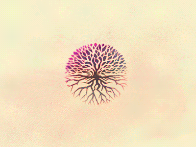
    This is another logo concept made for the same project of my previous shot. I think the process reveals all the concept clearly, but it a tree/hands/roots combo.

    Let me know what do you think about it, buddies. :

    PS. I think the positive version look more vibrant and the negative one loose the hands, what you think about it?

    likes

    about 1 year ago

  2. Mark Jooste Mark Jooste

    Brilliant!

    likes

    about 1 year ago

  3. Ben Muschol Ben Muschol

    WOW this is incredible

    likes

    about 1 year ago

  4. Andrey S. Rodrigues ☝ Andrey S. Rodrigues ☝

    great concept

    likes

    about 1 year ago

  5. Jonas Söder Jonas Söder

    stop it

    likes

    about 1 year ago

  6. Lucian Mangu Lucian Mangu

    How come today if you don't use a fancy blur/effect nothing looks good? Great concept nonetheless.

    likes

    about 1 year ago

  7. Jeremy Swinnen Jeremy Swinnen

    Love the colors in this one!

    about 1 year ago

  8. Nick Slater Nick Slater

    Sooo beautiful!

    likes

    about 1 year ago

  9. Osilly Osilly

    NICE!! I love it :)

    likes

    about 1 year ago

  10. Nemanja Jovanovic aka Fracturize Nemanja Jovanovic aka Frac...

    works super well Breno!

    likes

    about 1 year ago

  11. Michiel de Graaf Michiel de Graaf

    This is so neat!

    likes

    about 1 year ago

  12. David Gutierrez David Gutierrez

    Looks great! Shouldn't the hands be flipped horizontally? I assume they're facing upwards, if so, the thumbs should be on the opposite side. I don't know how you planned it. Just thinking out loud :)

    likes

    about 1 year ago

  13. Forefathers™ Forefathers™

    intense and nicely done! Love this

    likes

    about 1 year ago

  14. Breno Bitencourt Breno Bitencourt

    @David Gutierrez Good point, man!

    This was initially a mistake (haha), but seeing again I thought it could suggest a bond of two people instead of just one showing a path or something.

    Since this is just a concept, not a final version, I'm just sketching around, maybe with reverse thumbs it will look better, don't know, I must try. :)

    likes

    about 1 year ago

  15. Anthony Lane Anthony Lane

    Cool shapes. Curious as to how do your intricate and detailed marks render at smaller scale or what your plan is.

    likes

    about 1 year ago

  16. Aldrich Tan Aldrich Tan

    Oh, my god

    likes

    about 1 year ago

  17. Breno Bitencourt Breno Bitencourt

    Way to go, @Tony. I guess the client don't wanna go in this direction, but if so, there's a lot of work refining this mark to fit any smaller scales requirements. :)

    likes

    about 1 year ago

  18. Paul Ungureanu Paul Ungureanu

    Great concept and presentation. I'd tattoo this on me o.O

    likes

    about 1 year ago

  19. Breno Bitencourt Breno Bitencourt

    Nice idea, @Paul! would look amazing as a tattoo :D

    about 1 year ago

  20. Breno Bitencourt Breno Bitencourt

    @Lucian I like this blur effect a lot, give some kind of motion sense for anything. But it's just a way to present, nothing regard the logo concept or so. :)

    about 1 year ago

  21. ▲Claudiu Ungureanu ▲Claudiu Ungureanu

    love. love. love.

    likes

    about 1 year ago

  22. Marc-André Véronneau Marc-André Véronneau

    I love it!

    likes

    about 1 year ago

  23. Diego Gouvêa Diego Gouvêa

    Ooooohhh, treeeee!!! :P

    likes

    about 1 year ago

  24. Lewis Braid Lewis Braid

    This is so amazing. Really great execution!

    likes

    about 1 year ago

  25. Bryan Kearney Bryan Kearney

    Really great, I would never seen the hands if not for the animation.

    likes

    about 1 year ago

keyboard shortcuts: previous shot next shot L or F like