Find designers
Designer search
Quickly find your next designer
Post a job
The #1 job board for design talent
Inspiration
Courses
UX Diploma
Learn UX design from scratch in 6 months
UI Certificate
12-week UI skill building for designers
Live interactive workshops
with design professionals
Jobs
Go Pro
Log in
Dribbble: the community for graphic design
Advance your career with a Professional Diploma in UX Design
Learn more
Log in
Sign up
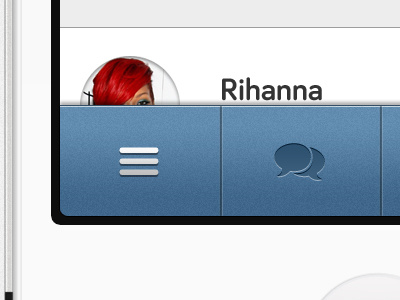
Menu Bar Blues
Andrew G C Smith
Follow
Following
Like
#F7F7F7
#5F8AAC
#3D6489
#232228
#B1B2B3
#A7201B
#7FA2C0
Download color palette
ios
iphone
menu
mobile
navigation
ui
user interface
View all tags
Posted on Jun 12, 2012
2,084
5
32
7
View feedback
Andrew G C Smith
More by Andrew G C Smith
View profile
Previous
Next
Loading…