Find designers
Designer search
Quickly find your next designer
Post a job
The #1 job board for design talent
Inspiration
Courses
UX Diploma
Learn UX design from scratch in 6 months
UI Certificate
12-week UI skill building for designers
Live interactive workshops
with design professionals
Jobs
Go Pro
Log in
Dribbble: the community for graphic design
Advance your career with a Professional Diploma in UX Design
Learn more
Log in
Sign up
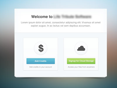
Choose Your Option
Paresh Khatri
Available for work
Follow
Following
Like
Get in touch
#F1F5F8
#B4D2DA
#A5A19E
#586463
#365055
#9EB569
#343A39
Download color palette
buttons
clean
form
simple
ui
View all tags
Posted on Jun 11, 2012
11,912
31
151
16
View feedback
Paresh Khatri
Get in touch
More by Paresh Khatri
View profile
Previous
Next
Loading…
Loading…
Loading…