@Samuel Kraft, thanks. The idea is to keep it a tiny little popup not annoying to the user but with a lot of functionality - like dragging images, sending big messages, adding multiple recipients, etc.
Oh btw, multiple recipients drop down is coming shortly in browsers in front of you! :)
Thanks, @Daryl. It's actually aligned on the right with the "Attached" dashed container - I know you can't see it now but I will upload a full shot shortly once I add some love to it.
I'll certainly rearrange these elements per your comment. I've been thinking along the same lines and now I see it does make sense as you pointed that.
16 Responses
Pro
Julia Khusainova
I've been thinking about the colors for the buttons to fit best. I think I got it.
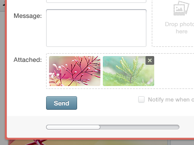
This is a Send message popup form where you attached photos to your message by simply dropping.
Comments are appreciated!
Follow me
12 months ago
Pro
Lewis Braid
Really like this! Is the bottom section a scroll bar or progress though?
12 months ago
Pro
Julia Khusainova
@Lewis Braid, it's a subtle progress :)
12 months ago
Pro
Dhiren Adesara
really nice work !
12 months ago
Pro
Avinash Tripathi
really nice !
12 months ago
great work! I love to see a fullview :)
12 months ago
Great approach with the color selection. The concept is a great idea. Keep it up!
12 months ago
Pro
Julia Khusainova
Thanks, guys!
@Andrey S. Rodrigues, I'll post the full size shot shortly :)
@Shad Romero, thanks much! I've been working on this color scheme quite for some time. Happy it's appreciated!
Client loves it too by the way so the goal is achieved :)
12 months ago
Pro
Samuel Kraft
Looks great. Loving the dashed strokes! Maybe use some more whitespace?
12 months ago
Pro
Julia Khusainova
@Samuel Kraft, thanks. The idea is to keep it a tiny little popup not annoying to the user but with a lot of functionality - like dragging images, sending big messages, adding multiple recipients, etc.
Oh btw, multiple recipients drop down is coming shortly in browsers in front of you! :)
12 months ago
Simple but different. Nice
12 months ago
Pro
Tanveer Junayed
STOP being that awesome. PLEASE
12 months ago
Pro
Kartik Mahant
This is solid as gelatine :)
12 months ago
Pro
Julia Khusainova
@Tanveer Junayed , @Kartik Mahant ✦✦✦ thanks so much guys! :)
12 months ago
Pro
Daryl Ginn
Excellent UI.
One thing to consider:
The '[] Notify me when ...' bit, i'd move it down a tad so it vertically center aligns with the send button, and possibly move it next to the button.
Great work, Julia.
11 months ago
Pro
Julia Khusainova
Thanks, @Daryl. It's actually aligned on the right with the "Attached" dashed container - I know you can't see it now but I will upload a full shot shortly once I add some love to it.
I'll certainly rearrange these elements per your comment. I've been thinking along the same lines and now I see it does make sense as you pointed that.
11 months ago