Farewell Postcard

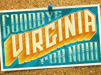
The first of two postcards as I leave Virginia to throw down in Palo Alto with @Nick Slater for the summer. So psyched. Lettering's all custom, of course.
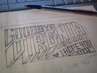
The first of two postcards as I leave Virginia to throw down in Palo Alto with @Nick Slater for the summer. So psyched. Lettering's all custom, of course.


