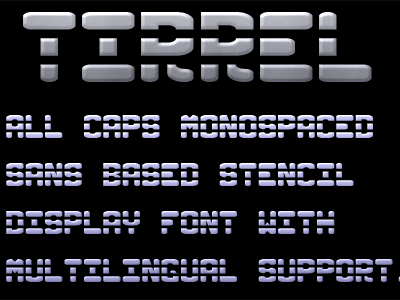
Tirrel Monospaced All Caps Sans Stencil Display/Logotype Font

I apologize for the repost, I had to delete the last 400 x 300 pixel text sample image that I put together because I misspelled multilingual. (DOH!)
Anyways, I am working on a commercial font. I thought I was done last week, but I keep finding stuff to improve. There are 2 versions of this font, so there are 3 font files. One is the harder, bolder version, this is the softer, more defined, easier to read version.
The third font is a mix of the hard, bold style in the caps and this soft style in the lowercase.
The reason there are two separate dedicated hard or soft font versions is in case the font becomes the logotype for someone, so then they can simply have the designer only use that one style as opposed to making unintended surprise changes to the logo, accidentally. Plus it helps with shift-key happy typers.
Each font, no matter the style (hard, soft, or the regular mix of the two) has alternate numerals way down in the Halfwidths and Fullwidths letterset. However, even though that works great with Photoshop, I see that Word 2013 doesn't support using those characters.
The font has over 250 glyphs and counting, so offers good punctuation and mutilingual support. Plus, it uses the unicode character set. It is also monospaced, which presents its own challenges in design.


