Awesome work Bill. I love this version more with the 'Reach your goals' nice and clear. My only comment would be that the Sign up text below the form doesn't have as much punch as the other text, perhaps with it being close to the whiter part of the background image.
I actually like B a lot more because it has a succinct emotionally-engaging statement. A is much more implicit. Channeling the "dont make me think" mantra, I'd vote B.
I agree with @David Browning 's mantra vote. B! Not sure about the arrow though. A version, points to Sign Up, which I get, a playful attention getter.... B version, it points down to the name. I am wondering if it doesn't take a way from the name? I am wondering what the negative space could do for highlighting the name? Both look fantastic mate. Very very nice!
23 Responses
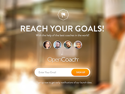
We are going to be doing a little A/B testing. The A version can be seen Here
about 1 year ago
great job Bill, as ever!
about 1 year ago
A for me mate
about 1 year ago
Awesome work Bill. I love this version more with the 'Reach your goals' nice and clear. My only comment would be that the Sign up text below the form doesn't have as much punch as the other text, perhaps with it being close to the whiter part of the background image.
about 1 year ago
Lovely work! Do you mind telling me what font are you using on "Reach your goals"?
about 1 year ago
@Marcello Manso http://www.myfonts.com/fonts/hvdfonts/brandon-grotesque/
about 1 year ago
I'm torn I like the "reach your goals" tagline but the name "OpenCoach" nearly isn't as clear/prominent on this version so I'd have to go with A
about 1 year ago
Thank you, man!
about 1 year ago
a for me :)
about 1 year ago
I already spent all of my words on this... Again it's so nice.
about 1 year ago
Maybe consider removing the exclamation point from "REACH YOUR GOALS!" Two in a row like that feels a little heavy-handed.
about 1 year ago
A for me!
about 1 year ago
they are both great, but I like B
about 1 year ago
@Brian Good call on the type ;)
about 1 year ago
My bet would be that B will convert higher, it's all about the headline! Great work....again!
about 1 year ago
A really delivers the message and looks like a personal approach, B is less personal but more corperate
about 1 year ago
Hard choice! Both are well made.
Maybe "B"… more incisive headline.
But my advice is to start an A/B test with real audience.
We designers are too often influenced by "aesthetics". Doh! :)
@Blake Hicks I agree with the redundancy of the exclamation point.
about 1 year ago
Thanks for all of the input. I def agree @Blake that we need to remove the double exclamation point. Good call.
about 1 year ago
A.
about 1 year ago
I actually like B a lot more because it has a succinct emotionally-engaging statement. A is much more implicit. Channeling the "dont make me think" mantra, I'd vote B.
about 1 year ago
Love it ! so clean :)
about 1 year ago
very nice :)
about 1 year ago
I agree with @David Browning 's mantra vote. B! Not sure about the arrow though. A version, points to Sign Up, which I get, a playful attention getter.... B version, it points down to the name. I am wondering if it doesn't take a way from the name? I am wondering what the negative space could do for highlighting the name? Both look fantastic mate. Very very nice!
about 1 year ago