'kyol' fancy rebrand
'kyol' logo idea, 2012.
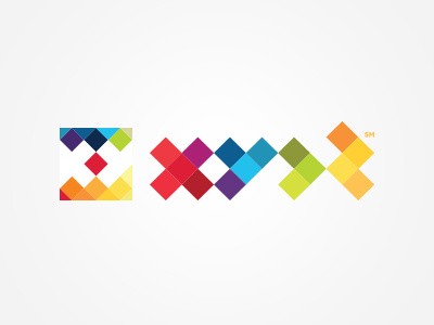
Taking cues from Paul Sych's extraordinary typographic work, as well as inspiration from older computer software aesthetic, this rebrand uses deliberately abstract glyphs to represent letters.
It works against modern buzzword trends of legible and 'web 2.0'-style letter forms, using instead the ambiguity of block shapes for representation.
I've always had trouble trying to get proper letterforms to work with my brand, due in part to its unique phonetic structure, and feel that the abstract visual approach works well instead of typical Latin glyphs.
protip: to better see the intended letter structure, close one eye and relax, tilt your head, hold your breath, and click 'Like'.


