Nice! Is it weird that I love looking over the dummy content? I think it really helps give this design some life. :)
My only gripe is the glow on the reply icons in the team sidebar. It just doesn't flow with the crispy-ness. Maybe lose the glow and give it a nice dense drop shadow, and obviously keep that nice blue? Or not, I still love the overall look and feel! :)
The bar separating the tasks from the conversations has the little bars showing that I can grab it and change the size of either window, but the lines are going the wrong way. They are vertical, but they should be horizontal.
Does that make sense? I can elaborate if that was too vague.
7 Responses
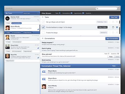
I've removed the header from the shot, as I can't give out the name just yet. imagine a nice logo and a search box above everything ;)
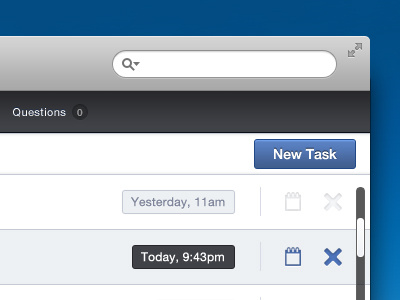
Attached full view!
about 1 year ago
Woot, great work Aaron! Text in the team search bar is a bit off when it comes to alignment though.
about 1 year ago
Nice work Aaron
about 1 year ago
Nice! Is it weird that I love looking over the dummy content? I think it really helps give this design some life. :)
My only gripe is the glow on the reply icons in the team sidebar. It just doesn't flow with the crispy-ness. Maybe lose the glow and give it a nice dense drop shadow, and obviously keep that nice blue? Or not, I still love the overall look and feel! :)
about 1 year ago
Really good stuff.
The bar separating the tasks from the conversations has the little bars showing that I can grab it and change the size of either window, but the lines are going the wrong way. They are vertical, but they should be horizontal.
Does that make sense? I can elaborate if that was too vague.
about 1 year ago
Thanks Brent, yea I thnk dummy content helps sell the design too - hardest part is coming up with a fake conversation :p
I agree with you on the glow, I'll see what it looks like with your suggestion. Cheers.
about 1 year ago
Cheers, @Carter De Angelis. Totally missed that! my bad haha.
about 1 year ago